Provider Credentialing System
Overview
Project Summary
I led the UX design and research for a provider credentialing system focused on streamlining the onboarding and verification process for healthcare professionals. The previous system relied heavily on manual data entry and was built without a strong UX foundation, making it unintuitive and inefficient. Poor information hierarchy, excessive cognitive load, and unnecessary complexity created significant friction for users. My goal was to create a seamless, guided experience that utilized automation and smart pre-fill technology to minimize effort and enhance accuracy.
My Role
- Lead UX Designer – Responsible for strategy, wire-framing, prototyping, and research.
- Lead User Researcher – Conducted moderated qualitative interviews and usability tests with providers and sales reps. Lead and coached two other teammates doing the same work.
- Design System Builder – Created an accompanying design system with scalable components and integrated existing components where applicable, ensuring consistency across the product.
Impact
✔ Reduced provider onboarding time through automation.
✔ Reduced support calls and the need for manual assistance by reducing previous interface friction.
✔ Improved provider satisfaction due to enhanced usability.
✔ Reduced support calls and the need for manual assistance by reducing previous interface friction.
✔ Improved provider satisfaction due to enhanced usability.
The Problem
Challenges in the Existing Workflow
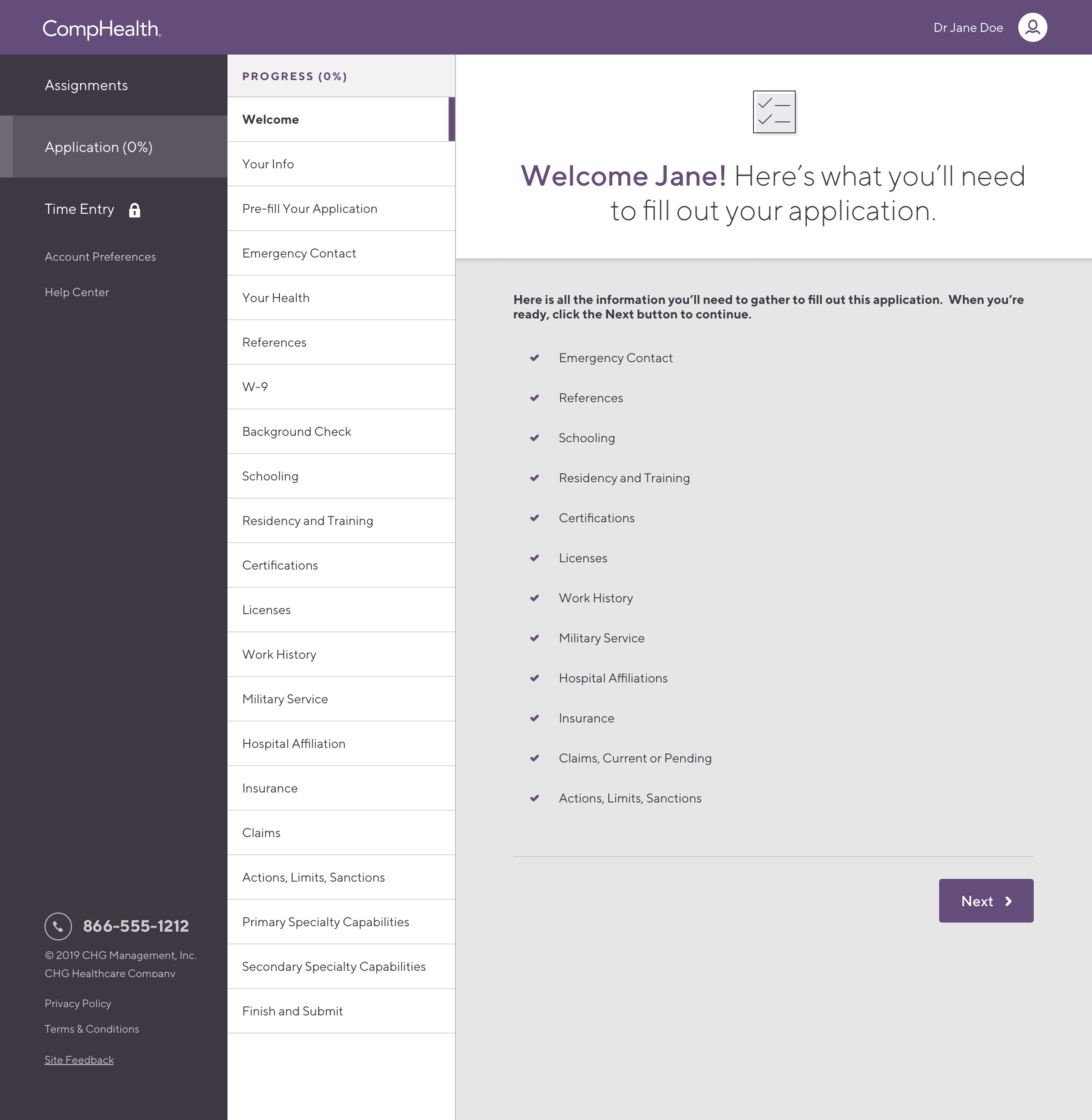
The credentialing process involved multiple pain points:
- Manual Data Entry – Providers had to input the same information multiple times across different forms.
- Lack of Smart Automation – No pre-fill functionality to retrieve existing provider data.
- Confusing Form Structure – Forms were excessively long and overwhelmed users.
- Process Bottlenecks – Providers would give up on the form and call in and request assistance.
Research & Insights
Understanding the Users
I conducted and lead eight in-depth research interviews to identify key pain points:
- 5 provider interviews – Understanding frustrations with the current credentialing experience.
- 8 provider interviews as lead – Teaching and guiding others to conduct credentialing interviews.
- Competitive analysis – Reviewing best practices from similar platforms.
Key Findings
✔ Time it took was biggest frustration – They wanted to be able to save their place and jump around over the course of many days of work filling out the form
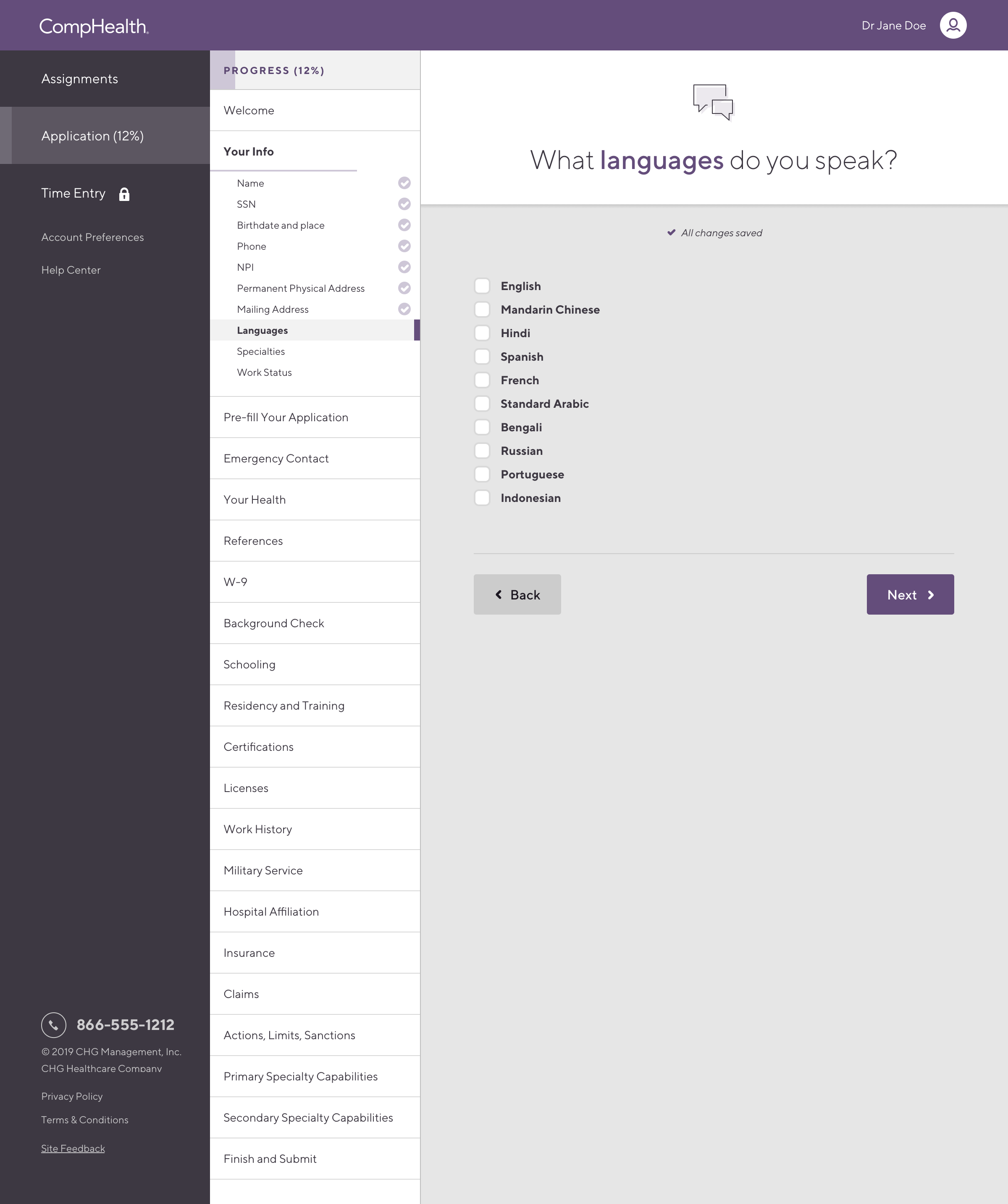
✔ Providers wanted us to pre-fill as much as possible – Some fields could be automated using NPI (National Provider Identifier) lookup.
✔ Providers lacked visibility into their application status – Leading to frequent support calls.
✔ Providers wanted us to pre-fill as much as possible – Some fields could be automated using NPI (National Provider Identifier) lookup.
✔ Providers lacked visibility into their application status – Leading to frequent support calls.
The Solution
1. Smart Pre-Fill & Data Automation
- Integrated a NPI lookup API to auto-populate some provider details.
- Designed inline data suggestions based on the returned data to reduce manual input errors.
- Created a step-by-step guide to use the provider's NPI and have them approve the returned data
💡 Impact: Eliminated some of the manual entry, improving form completion speed.
2. Streamlined Form Structure
- Grouped related fields together to create logical chunks that could be dealt with independently.
- Designed a form with many jumping in and out points so the user could fill out the application throughout their week and in between their other daily tasks.
- Provided better real-time validation and field masking to catch errors before submission.
💡 Impact: Reduced application abandonment.
3. Clear Markers Where You Left Off
- Created condensed navigation to all the distinct parts of the application so that it was visible on one screen
- Added progress bars to each part of the navigation to clearly indicate what was left to do
- Added an overall progress bar for the entire application to let the user know at a glance how much they had left
💡 Impact: Eliminated the need to go back through the entire application to find where you left off, shaving off minutes of wayfinding on each return visit
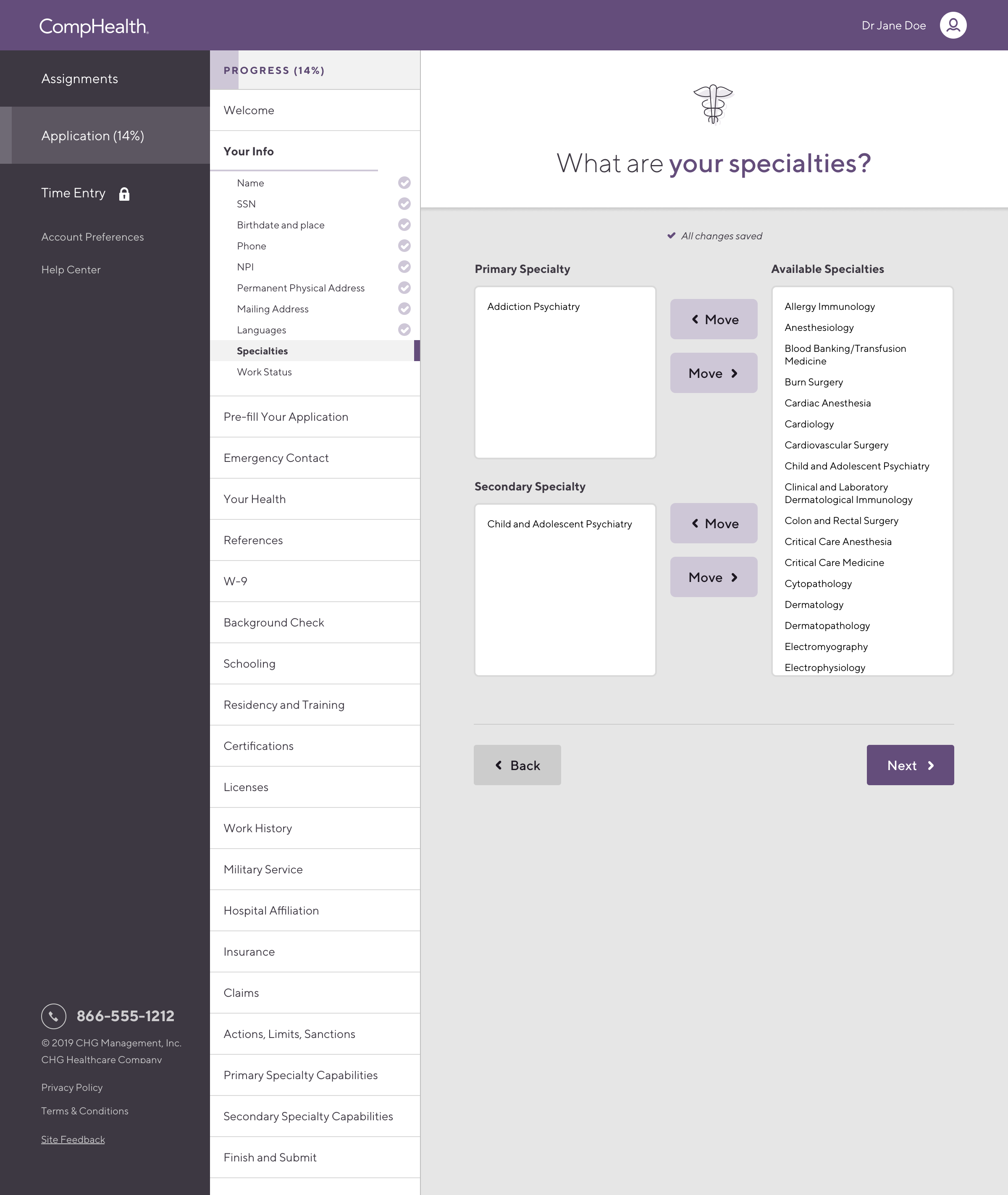
4. Redesigned Work History Entry
- Redesigned the work entry list to be it’s own screen eliminating confusion
- Moved the add work entry form to a separate dedicated screen so the user could handle entering work history one at a time
💡 Impact: Increased clarity and speed of entry
Process & Execution
High-Fidelity Design & Developer Handoff
I developed wireframes to explore different layouts, followed by a high-fidelity prototypes in Figma for all screens.
User Testing & Iteration
- Conducted 8 usability tests with providers to refine workflow and individual user interfaces.
- Iterated on navigation and progress indicators based on overwhelming feedback.
Design System Implementation
- Standardized all the UI components down to 11 page types, 14 simple components and 13 complex components.
- Documented all the components and patterns for engineering to help them plan and reduce the scope of their work.
Final Outcome & Results
✔ Faster Credentialing – Eliminated the friction points that prevented users for finishing credentialing previously.
✔ Higher Form Completion Rates – Redesigned the application around the workflow users wanted, to be able to jump in and out of the application throughout their week.
✔ Higher Provider Satisfaction – Users reported a much smoother experience that worked how they wanted to work.
✔ Higher Form Completion Rates – Redesigned the application around the workflow users wanted, to be able to jump in and out of the application throughout their week.
✔ Higher Provider Satisfaction – Users reported a much smoother experience that worked how they wanted to work.
Lessons Learned & Next Steps
Key Takeaways
✅ Automating repetitive tasks makes a huge impact – Pre-filling data significantly reduced provider effort and dramatically increased their satisfaction.
✅ Status visibility reduced user anxiety – Clearly showing the user where they left off and exactly what they had left to do prevented them from hunting through the entire application to figure out what to do next.
✅ Good form design increases engagement – A structured, step-by-step approach that fits how users want to use the form encouraged completion.
Next Steps
🔹 Expand pre-fill automation to additional data fields.
🔹 Implement AI document OCR to further fill out the form automatically.
🔹 Conduct long-term studies to measure efficiency improvements over time.
🔹 Implement AI document OCR to further fill out the form automatically.
🔹 Conduct long-term studies to measure efficiency improvements over time.
Visuals and Designs