I led the creation of a scalable design system to bring consistency, efficiency, and accessibility to a rapidly expanding UX team. Before the design system, our teams worked in silos, leading to inconsistent UI patterns, redundant design work, and misaligned development efforts. I recognized the opportunity to standardize components, improve collaboration between designers and engineers, and create a foundation for future scalability.
This case study incorporates insights from my previously published article on how we started building a successful design system.
Scalable Design System
Overview
Project Summary
My Role
- Design System Lead – Defined system architecture, established UI patterns, and oversaw implementation.
- Cross-Team Facilitator – Conducted ongoing workshops to aligned designers, engineers, and product managers.
- Design Process Optimizer – Developed workflows and best practices to improve collaboration and streamline implementation.
Impact
✔ Reduced design and development time by implementing reusable components.
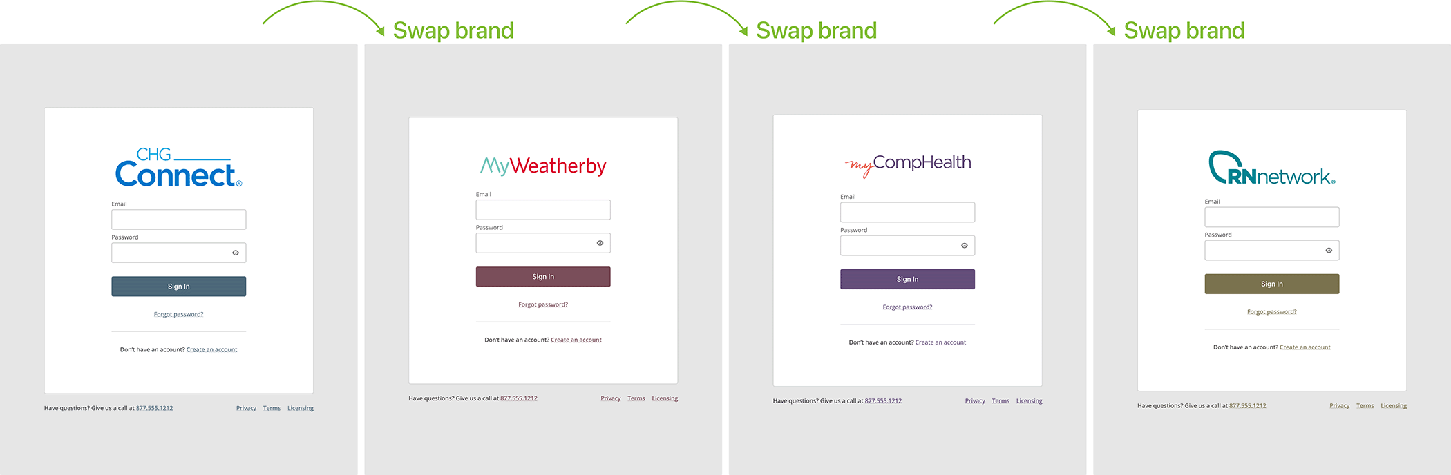
✔ Increased UI consistency across 5 products, enhancing brand and user experience.
✔ Reduced engineering rework by improving cross-team efficiency.
✔ Increased UI consistency across 5 products, enhancing brand and user experience.
✔ Reduced engineering rework by improving cross-team efficiency.
The Problem
Challenges Before the Design System
The lack of a standardized design system led to several critical issues:
- UI Inconsistency – Designers were using multiple variations of buttons, form fields and navigation components across different products.
- Redundant Work – Without shared libraries, designers and developers redesigned and rebuilt components from scratch over and over again.
- Scalability Limitations – As the team grew, maintaining consistency across multiple products was never dealt with.
Research & Insights
Understanding the Gaps
To define the design system’s scope, I conducted:
- Design Audits – Reviewed 5+ existing products to identify inconsistencies.
- Survey of Internal Teams – Identified the most-used UI elements to prioritize in the system.
- Competitive Benchmarking – Analyzed leading design systems (e.g., Atlassian, Material Design) to identify best practices.
- Designer and Stakeholder Discussions – Gathered insights from our designers, engineers, and product managers to uncover pain points.
Key Findings
✔ The most successful design systems prioritize flexibility over strictness – Our system needed to be adaptable for different teams.
✔ Governance and adoption are as important as component creation – Our issue wasn’t the lack of design systems it was that we had so many and none of them agreed with each other.
✔ Collaboration drives system success – Getting our designers all on the same page was the foundation to any successful creation and adoption
The Solution
1. Establishing a Shared Component Library
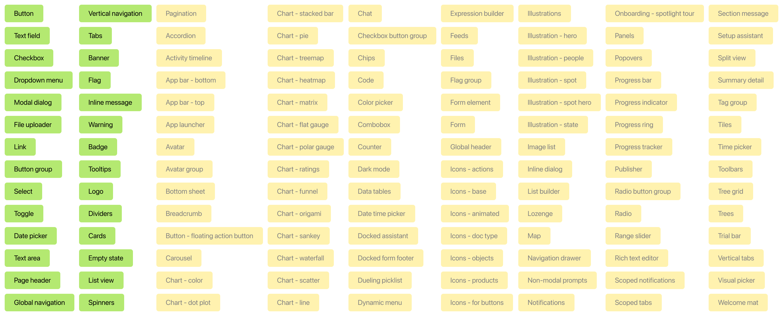
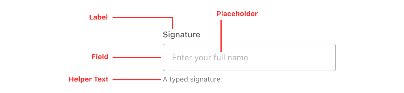
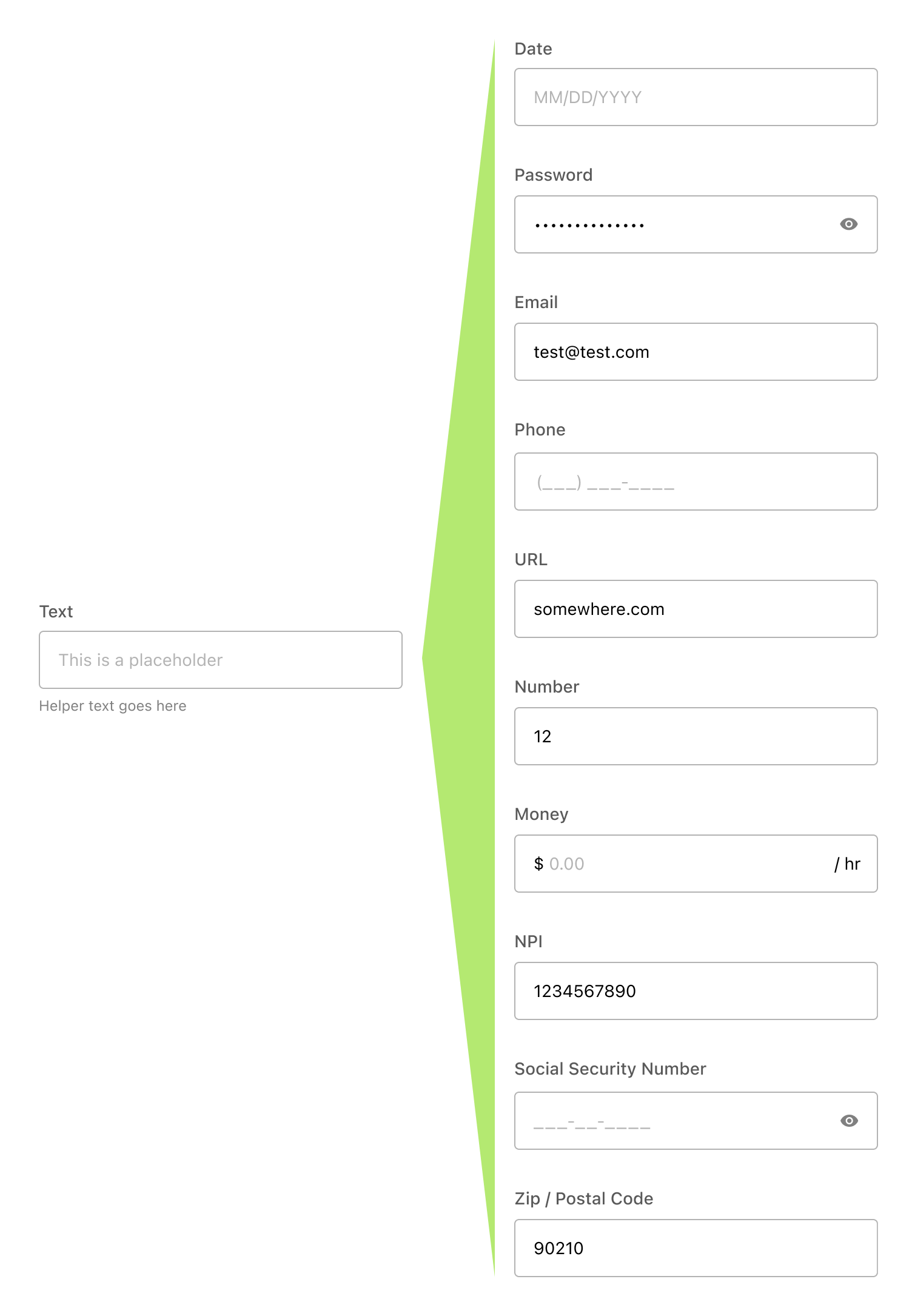
I created a centralized design library in Figma, featuring:
- Typography, Color, and Spacing Guidelines – Standardized for brand alignment and visual consistency across designers.
- Reusable UI Components – Buttons, input fields, dropdown menus, and more designed for scalability.
- Detailed interaction agreements – Ensured a consistent, predictable experience for users in the micro interactions.
💡 Impact: Reduced redundant design work, decreasing effort across teams.
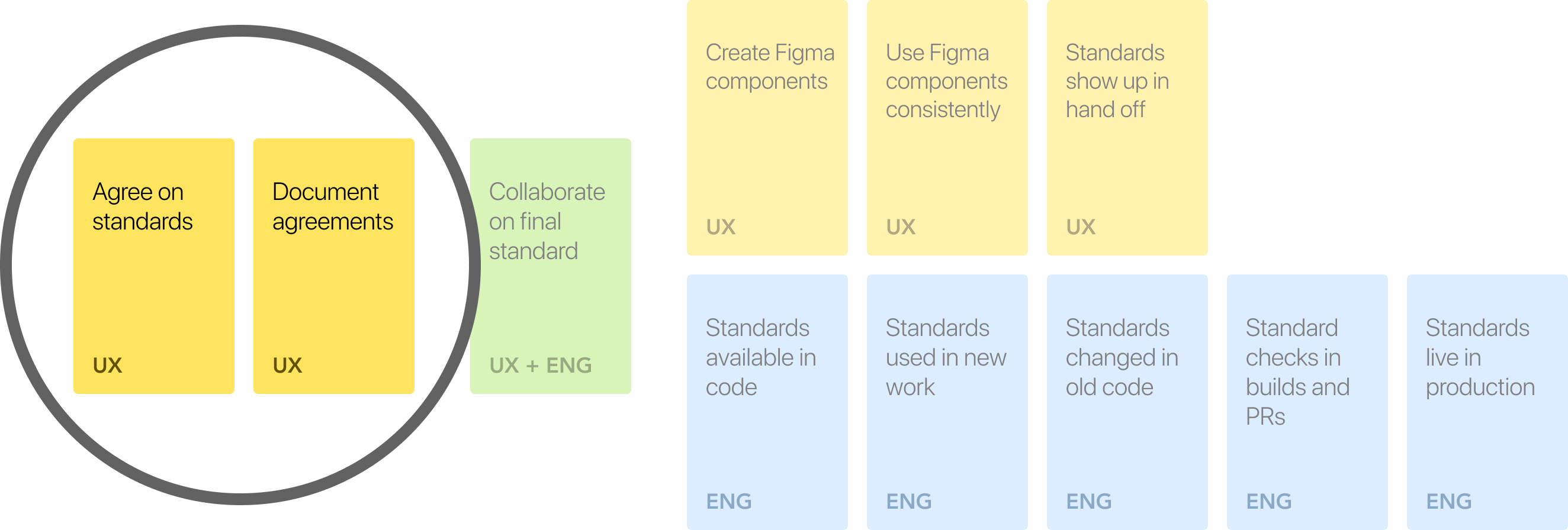
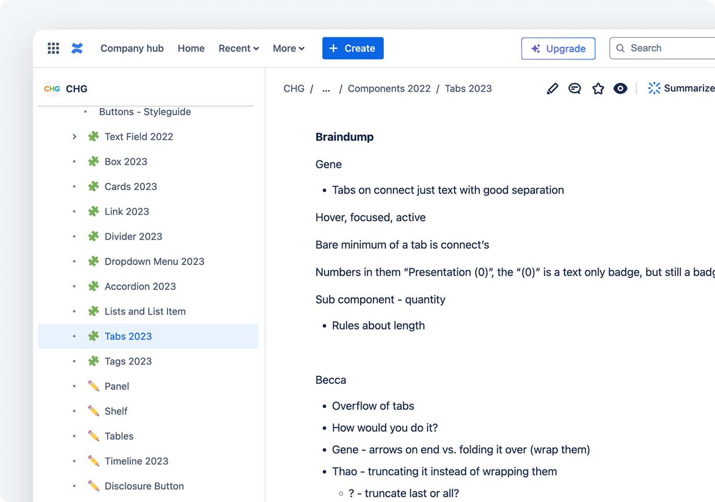
2. Strengthening Designer-Designer Collaboration
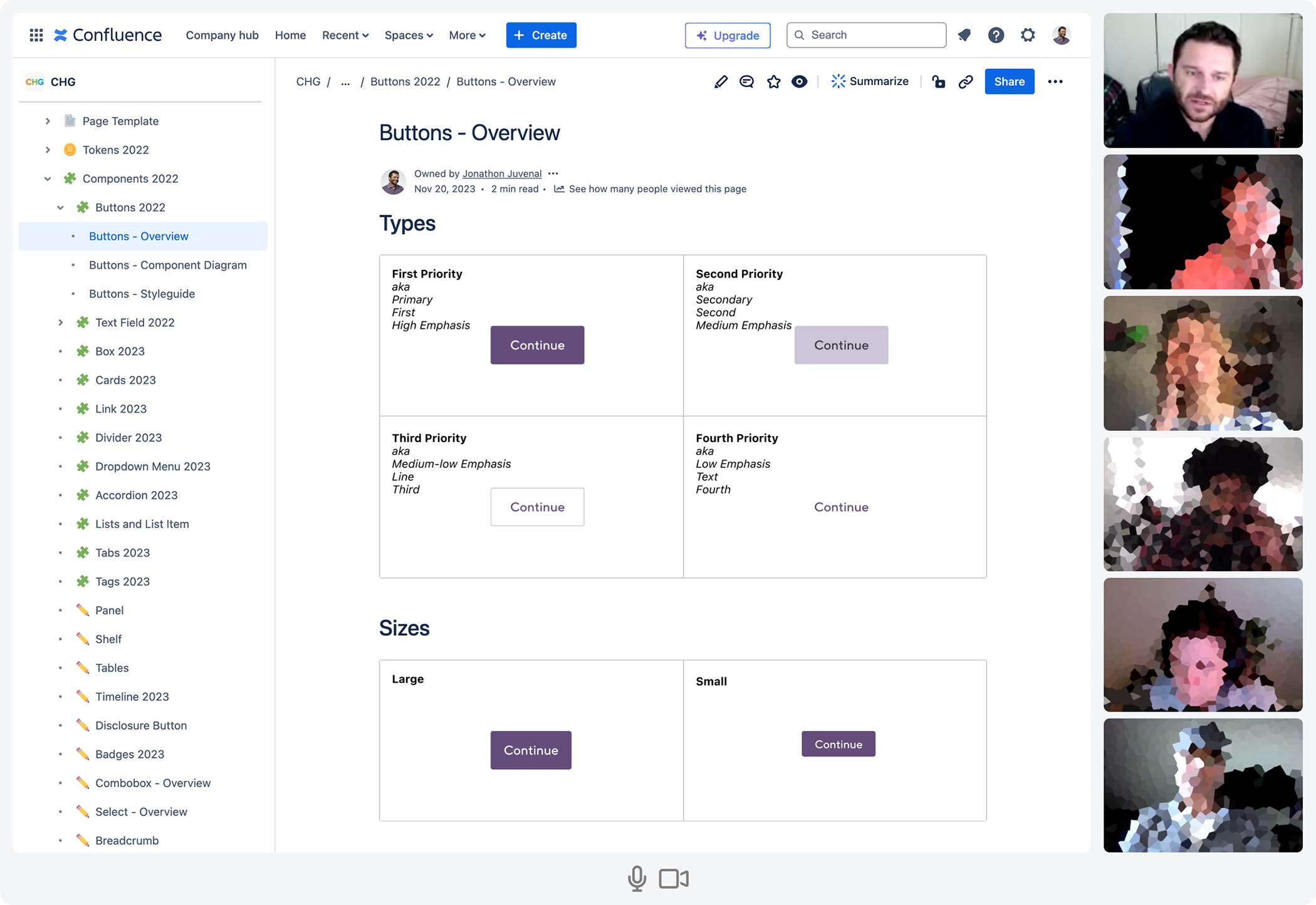
- Facilitated collaboration between our nine designers to ensure seamless translation of design system agreements between teams.
- Developed component documentation in Confluence, including usage guidelines to streamline remembering and referring to what we agreed on.
- Established constant dialog between the designers about design systems so they were more than comfortable collaborating with each other outside our design system meetings.
💡 Impact: Reduced design-to-designer issues, accelerating consistency and reuse.
3. Improving Efficiency with Scalable Design Patterns
- Developed reusable design patterns that standardized interactions across multiple products, reducing inconsistencies and redundant work.
- Created detailed specs for frequently used components, making it easier for designers to build new interfaces efficiently.
- Established a governance model for maintaining and evolving the design system, ensuring long-term consistency across teams.
💡 Impact: Designers could use our design system agreements faster and more easily in their current projects.
4. Driving Adoption Across Teams
- Created detailed documentation outlining best practices for usage.
- Hosted weekly and monthly design system workshops for all the designers to get together and hash things out.
- Introduced a feedback loop to continuously refine components based on real-world use.
💡 Impact: Achieved adoption across product teams almost immediately
Process & Execution
Ongoing Discussion Meetings
- Led the team in bi-weekly discussion meetings to discuss all the finer details about everything in the design system
- After a year established a smaller working group that did most of the work and then met with the other designers once a month to get their buy in and feedback
User Testing & Iteration
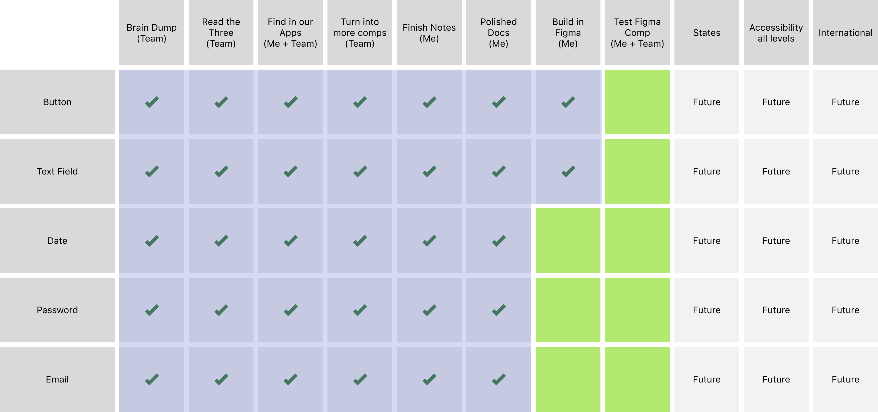
- Conducted usability tests with the designers to see how well they understood and would actually use the Figma components we had created for them
- We found that no one on the team had enough experience with Figma components and so we developed an education program to teach them
Design System Implementation
- Achieved team consensus on thirty-five components and the detailed specifications
- Documented all thirty-five components on Confluence for easy reference and so that our work would never get lost or forgotten
Final Outcome & Results
✔ Faster Design & Development Cycles – Reusable components drastically reduced design and coding time.
✔ More Consistent UI Across our Five Products – Strengthened user experience consistency and improved usability.
✔ Reduction in Designer Rework – Standardized components reduced time spent reinventing the wheel.
✔ More Consistent UI Across our Five Products – Strengthened user experience consistency and improved usability.
✔ Reduction in Designer Rework – Standardized components reduced time spent reinventing the wheel.
Lessons Learned & Next Steps
Key Takeaways
✅ Adoption is more than just creating components – Success depended on education, governance, and ongoing discussions.
✅ Design systems must be flexible yet structured – Providing clear guidelines while allowing individual designers the ability to customize things was crucial.
✅ Clear and detailed documentation is crucial for adoption – Well-structured guidelines and training sessions helped ensure the designers could use the new design system effectively.
Next Steps
🔹 Expand the system to cover the entire list of components we identified we needed
🔹 Start discussing and documenting organisms and complex UI patterns.
🔹 Continue and expand usability testing with the designers to ensure adoption.
🔹 Continue to expand education program to teach the designers the design system skills they needed.
🔹 Start discussing and documenting organisms and complex UI patterns.
🔹 Continue and expand usability testing with the designers to ensure adoption.
🔹 Continue to expand education program to teach the designers the design system skills they needed.
Visuals and Designs